Showing posts with label Brand Developments. Show all posts
04 September 2017
Over & Out
You might have noticed that we have not blogged for quite a while, and that's because we have been reviewing things. Reviewing our branding, our website, our social presence, and more to the point our time.
After many years of enjoying blogging, we have come to the conclusion that it's time to close this door. Although an enjoyable thing to do, we just cannot dedicate the time to it any longer, alongside our work load. And as Jay put it when I couldn't quite find the words, it has begun to feel like it 'It's all up in our space' - for want of a better and um, less gangster term.
A huge thank you to all that have followed our posts over the years. We will be leaving the blog right where it is for you to dip back into at any point, but all future updates will be done via our Facebook page - so come and connect with us: https://www.facebook.com/leaffdesign. See you there!
24 April 2017
'McGowan' Branding
A couple of weeks ago saw the launch of the new branding for the very lovely cake artist, Sharon McGowan. She has been established for some time, yet her brand hadn't developed in the same direction or at the same rate as her business had, leaving her high-end service with a very mismatched, low-end visual.
The project was super fun to work on, with all of it's glamour and femininity. We covered a full re-brand, with printed materials (such as promotional cards), and a brand new custom-made website. You can find visuals to all of this below, and by visiting her website www.mcgowanweddingcakes.co.uk.
20 June 2016
White of the Waves, Branding // In the Studio
White of the Waves is a new, experimental, instrumental band, who needed a strong identity and album artwork to launch their debut EP.
The branding and artwork captures not only the strong character of the band, but their unique and exciting music too. The band have a strong, adventurous and outdoorsy character, and an incredibly laid back attitude - lovers of nature, creativity, and of course music - which are all qualities that are reflected in their music. Experimental in nature, their music is melodic, deep, powerful and funky - and always surprising.
We worked with Kolor Skemes to print their album artwork on an Indigo press, and then hand finished it with bottle ring prints using Innis & Gunn beer bottles in gold, and hand stamped triangle mountains in their vibrant brand yellow.
To see the full portfolio for this project, and more, visit our website here. White of the Waves EP debuts in 2017 - set date to be announced. We are in the process of building the website, which will be launched in the Autumn.
18 April 2016
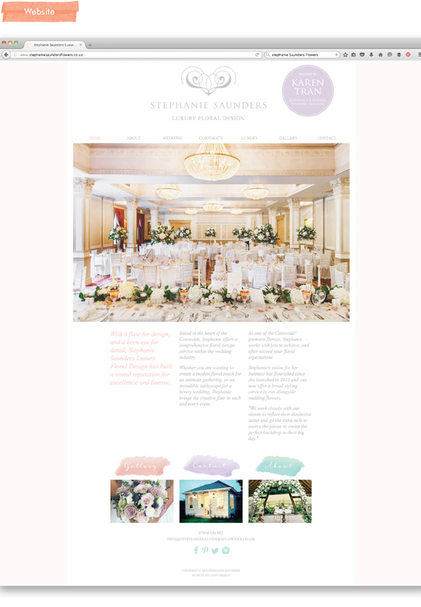
Stephanie Saunders Flowers, Rebrand // In the Studio
Stephanie had outgrown her previous branding, and needed her new identity to reflect where she is now. Stephanie Saunders has grown rapidly over the last few years, and has built a sound reputation for excellence and finesse. Her new branding needed to showcase this growth, and her place in the luxury sector.
We created a clean, fresh brand with a palette of feminine pastels and surface patterns inspired by the materials she works with. Using thick, quality stock in her brand colours, her business cards were hot foiled and foil edged for that real sense of luxury, and the website has not only improved on look, but on functionality; combining ease of use with a perfect backdrop to showcase her beautiful work.
Find this project and more in our portfolio, and find out more about Stephanie Saunders, here.
Business Card foiling by David Ward Printing.
18 January 2016
Fennie Designs Branding // In the Studio
Fennie Designs needed a brand that reflected the bold, confident and passionate nature of the company. We created a fun, memorable brand with a bright, creative palette, and surface patterns inspired by the cuttings of the papercut process, as well as the blade used to create the art.
Find this project and more in our portfolio, and find out more about Fennie Designs, here.
01 December 2014
Self Promotional Notebooks // In the Studio
Since launching our new brand, we have been working around projects to finish some really special promotional material. Part of the packages for this self promotion are beautifully bound notebooks, which we are giving as gifts.
We really wanted to capture the sense of possibility that a beautiful notebook brings; of what big ideas and inspiration could fill it. You almost form a relationship with it and embark on a recorded journey.
Our books were litho printed using Pantone ink, onto uncoated, recycled stock, and specially bound using the singer sewn technique, in contrasting thread.
Design Leaff Design, printing Lemon Press, binding Allsopps.
10 November 2014
Nurture Outdoor Kindergarten - The Signage // In the Studio
We last posted about the brand and materials that we created for Nurture
Outdoor Kindergarten a couple of weeks ago - if you missed it, catch up here. Since then, we have been working our socks off on the completion
and on-site installation of their signage, which we not only designed,
but made too.
When we say we are a family company, we
aren't kidding, and woodwork is a speciality.
Jay's dad is an expert woodworker - he was taught all he knows by his father, who was a professional carpenter - and those skills were passed down
to Jay too. Between them, they are capable of fantastic things, and as
you can see from this signage for Nurture, their skills really show.
27 October 2014
Nurture Outdoor Kindergarten // In the Studio
Nurture Outdoor Kindergarten needed a brand that reflected their umbrella brand, Nurture, while being able to stand alone as a separate part of the business.
We created a memorable, playful suite of logos and a natural, earthy palette, to compliment and use with their umbrella palette of light bight shades. Being an outdoor kindergarten, the idea for the brand stemmed from the great outdoors and what you might find there. Marching ants and scattered leaves, are but a few of the charming illustrations that interact with and bring to life their special promotional mailer, which marked their forthcoming launch of the Kindergarten in January 2015.
To find out more about Nurture Outdoor Kindergarten or to enquire, pop on over to their website, www.nurturekindergarten.com.
We are currently working on their on-site signage, which we will have up on here very soon!
04 July 2014
Studio Time: Nurture, Brand Development
Nurture are childcare, play and education specialists, who came to us last Autumn to set up their exciting company with a knock-out brand.
Nurture needed a brand that would be unique, friendly, approachable, warm and sensitive. They needed to get across their expert, dependable and supportive approach, while allowing their open, fun and exciting nature to shine through.
The design idea stemmed from their company mantra, 'nourishing and nurturing by stimulating curiosity and offering opportunities to explore, experiment, and understand', coupled with inspiration from shape-sorters, and how they look to do just this.
27 April 2011
Felice - The Summer Collection 2011
So finally, here it is, the result of a very exciting recent project, and one that we have been meaning to share for a while.
These are the invitations to the launch of the summer collection of clothing at Felice - a Worcester based ladies clothing shop, which sells quality, mostly Italian made clothing.
This project was especially exciting because we got to experiment with various finishes, which gave very big results. The use of silver metallic ink on the heavy weight, navy, uncoated antique stock, gives an air of quality and class, and it feels really substantial. Teamed with the satin stock of the polaroid picture - a snapshot of their collection - the contrast is lovely to feel and see.
More pictures are now available on our website: www.leaffdesign.co.uk
Subscribe to:
Posts (Atom)