Showing posts with label Behind The Scenes. Show all posts
04 September 2017
Over & Out
You might have noticed that we have not blogged for quite a while, and that's because we have been reviewing things. Reviewing our branding, our website, our social presence, and more to the point our time.
After many years of enjoying blogging, we have come to the conclusion that it's time to close this door. Although an enjoyable thing to do, we just cannot dedicate the time to it any longer, alongside our work load. And as Jay put it when I couldn't quite find the words, it has begun to feel like it 'It's all up in our space' - for want of a better and um, less gangster term.
A huge thank you to all that have followed our posts over the years. We will be leaving the blog right where it is for you to dip back into at any point, but all future updates will be done via our Facebook page - so come and connect with us: https://www.facebook.com/leaffdesign. See you there!
27 September 2016
Church branding first draft
We first shared the progress of the church project last month (catch up here) when we were delving into first ideas, having nailed down the mood board and colour psychology. Since then, we have pulled together the first draft of the branding, which we are excited to share with you here.
The logo needed to be a careful balance between old and new, and it needed to be as confident and future facing as the project itself. We didn't want to lose the heritage of the building, and the fact that it will always be a church, but the re-ordering is about making this more about community than religion. This is an ambitious project, with all eyes firmly on the future - both in the sense of the use of the building, but also in terms of who will be keeping it standing for years to come, which are primarily the young families within the village.
The both abstract and subtle hint of the heritage, with the clean modern font and optimistic use of colour make this a distinctive and confident first draft of the logo. From here, we are already having ideas about trying out texture and even pattern.
This ambitious and warm palette was lead by the Autumn character of this brand, and inspired by the colours of the church year. While the strong red evokes determination, passion and reassurance, the blue both soothes and calms, bringing a sense of reflection and communication. The green is all about the restorative, abundant and self-sufficient nature of the project, while the yellow instills optimism, confidence, and emotional strength, which is vital for a community space. The pop of gold - which would be used in the hot foiling process for printed material - brings that wise, compassionate and giving vibe, which is in beautiful contrast to the rich purple, and it's visionary, truthful and spiritual traits. This strong palette is balanced by the neutrals of the browns, and their stable, reliable, honest attributes. The fonts are a mix of modern serifs, which give that traditional feel, and a contrasting hand written accent, which is approachable and warm.
Inspired by the existing architecture of the church building, and influenced by the Autumn personality, the surface patterns and brand elements are a mix of intricate pattern, slightly wobbly illustration, interesting image treatment and natural texture. We are excited to see how these surface patterns might engage more with the brand elements.
Rolled out over potential printed material, we can see how the whole brand works together. It will be great to see how the branding develops from here, and how it will work with any material that is decided upon. We will continue to share these developments with you as we go along.
Note: The images used in the printed material are placeholders, and not our own images. Sources unknown.
The both abstract and subtle hint of the heritage, with the clean modern font and optimistic use of colour make this a distinctive and confident first draft of the logo. From here, we are already having ideas about trying out texture and even pattern.
Inspired by the existing architecture of the church building, and influenced by the Autumn personality, the surface patterns and brand elements are a mix of intricate pattern, slightly wobbly illustration, interesting image treatment and natural texture. We are excited to see how these surface patterns might engage more with the brand elements.
Rolled out over potential printed material, we can see how the whole brand works together. It will be great to see how the branding develops from here, and how it will work with any material that is decided upon. We will continue to share these developments with you as we go along.
Note: The images used in the printed material are placeholders, and not our own images. Sources unknown.
22 August 2016
Church branding with an autumn personality
One of our current projects includes branding for a local church, which is undergoing some pretty major re-ordering. It is a unique project, and a very exciting one to be a part of. Here, we share what has gone into the process of developing the branding so far...
After creating an initial mood-board, to visualise the direction of the creative work, we delved into detailed research and colour psychology. The initial mood-board included a selection of colours, fonts, logo inspiration, key wording, pattern and texture ideas.
The key focus for the re-ordering is to create a community space where people feel supported by and connected to each other. The restoration and long-term plan is for the building to be a warm, innovative, sociable and forward-thinking space, evoking a calm, passionate and restorative vibe. With these key attributes in mind, this as a truly Autumn personality with a little touch of Spring.
As we defined in our last post on colour psychology, the Autumn personality is ambitious, unique and passionate. Colours are earthy, bright and warm, with powerful depth and strength. After exploring palette inspiration, we worked up a palette of shades that reflected these strong attributes, while being a little sympathetic to the sociable, and open traits of Spring.
With camera in hand, we set about some detailed photography of the church, to search out possible inspiration for surface pattern / brand icons. There was an abundance of pattern and texture to be found. The nature of the Autumn personality lends itself to the natural textures of the wood and stone, and hand illustration too - all of which we explored. Fonts are strong, chunky and confident, and modern serifs evoke that traditional feel, while hand-rendered fonts support that inclusive, open feel.
Logo ideas flowed from all research and inspiration that we had gathered. It is all about trying everything, and keeping on going, and going some more. Seemingly weak ideas can spark gems, and seeming gems are pushed too far, to inspire new ones, or to give clarification to the original spark. It is a free experience - it has to be limitless, shameless, and relentless in order to find the strong, confident, definite solution that we are seeking.
We will post more about this project in due course, but for now, we hope that this has been a fun insight into our processes for any of you who are unfamiliar, curious or inspired by how the design process works, behind the scenes.
After creating an initial mood-board, to visualise the direction of the creative work, we delved into detailed research and colour psychology. The initial mood-board included a selection of colours, fonts, logo inspiration, key wording, pattern and texture ideas.
The key focus for the re-ordering is to create a community space where people feel supported by and connected to each other. The restoration and long-term plan is for the building to be a warm, innovative, sociable and forward-thinking space, evoking a calm, passionate and restorative vibe. With these key attributes in mind, this as a truly Autumn personality with a little touch of Spring.
As we defined in our last post on colour psychology, the Autumn personality is ambitious, unique and passionate. Colours are earthy, bright and warm, with powerful depth and strength. After exploring palette inspiration, we worked up a palette of shades that reflected these strong attributes, while being a little sympathetic to the sociable, and open traits of Spring.
With camera in hand, we set about some detailed photography of the church, to search out possible inspiration for surface pattern / brand icons. There was an abundance of pattern and texture to be found. The nature of the Autumn personality lends itself to the natural textures of the wood and stone, and hand illustration too - all of which we explored. Fonts are strong, chunky and confident, and modern serifs evoke that traditional feel, while hand-rendered fonts support that inclusive, open feel.
Logo ideas flowed from all research and inspiration that we had gathered. It is all about trying everything, and keeping on going, and going some more. Seemingly weak ideas can spark gems, and seeming gems are pushed too far, to inspire new ones, or to give clarification to the original spark. It is a free experience - it has to be limitless, shameless, and relentless in order to find the strong, confident, definite solution that we are seeking.
We will post more about this project in due course, but for now, we hope that this has been a fun insight into our processes for any of you who are unfamiliar, curious or inspired by how the design process works, behind the scenes.
13 January 2016
Sweet '16 // In the Studio
To kick off the New Year, we created this short stop-motion animation to launch our Sweet '16 offer, of 16% off any projects booked between now and April 1st 2016.
Making the film was immense fun - a chance for us to dabble in an area of design that has inspired us and excited us for some time. I got to explore and get messy with water colours to produce the fun, creative imagery, and Jay got to animate it all. Together, we also created the soundtrack to the video - you may remember a share on Facebook a few weeks ago of Jay in the studio with his guitar.
We are creatives for creatives, and we hope that this inspires you to browse our website to see what we can do for you. We would love you to get in touch to discuss your project with us. Let's make this an irresistibly sweet '16!
12 October 2015
New Brand Design // In The Studio
This week we have begun the first stage of work on a new and exciting brand design, for Stafford based paper-cutter Fennie Designs ('Fruity' cut by Fennie directly above). Fennie is bold, bright, warm and passionate; expert and high end, and needs a brand that reflects this.
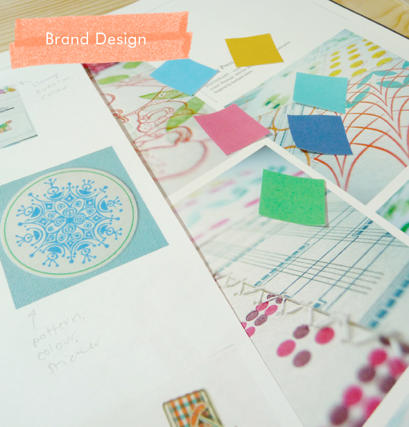
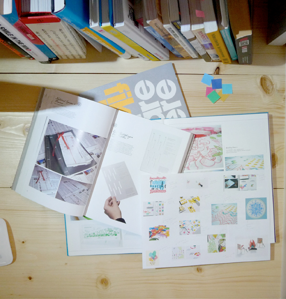
The start of a project is always so exciting. It is the opportunity to get lost in our endless books of inspiration, to draw on colour and concepts, and let ideas roll out of all control - it is wide open and anything is possible. We really look forward to seeing where things lead us, and sharing the end result with you in due course.
Do you have a business in need of re-connection with it's brand? See what we can do for you... leaffdesign.co.uk.
21 December 2012
Our Christmas Mailer (that was not to be)
As some of you may have heard on Twitter, we've had a bit of a tough week with the collapse of our Christmas mailer - and what was typically set to be our best yet. So much of our hard work and money had gone into them, and they were set to arrive with Leaff's clients and friends alike by this morning. Alas, all it took was one supplier to let us down and it was all over, which has been very hard to swallow. So to all of our clients and friends, we are very sorry that instead of this intriguing mailer, nothing at all has ended up on your doorsteps this Christmas - we are crushed.
Since we put so much into the mailer and it cannot be re-used next year, we have decided to share it with you here. The bit that didn't get done has been super-imposed so you can get a really good idea
of what the finished thing was going to look like...
We had duplexed single cards using heavy stocks in our corporate red and snowy white. While the red sides were supposed to have our Mayan-themed design spray painted onto them in white, the reverse snowy white sides were where our personal, handwritten messages were displayed. These were teamed with transparent promotional slips and the whole thing was to be housed within teaser envelopes.
It would have been great - it was great.
We really hope that you can all take some enjoyment out of looking over these pictures and the description of our ideas at least. What we will take from it is self-appreciation for all of the effort we
put into this mailer, and how much fight we had to get it done - despite the fact that we have been in
the midst of the busiest few months that we have ever had.
Somehow, among all of the project work, we managed to plough ourselves into this personal project in what spare time we had, and really exercise our imaginations to come up with fresh, exciting ideas, utilising new techniques. We have developed as designers from this project by trying new things
- which is always what we aim to do with every personal project like this - and although we are still
licking our wounds from being so let down by the supplier, we are determined to take the positives out
of this and feel proud of what we had tried so hard to do.
Most of all, we are feeling sorely disappointed that our clients and friends have gone without this year,
so if all this post does is inform you all that we had planned great things and you were not forgotten,
then it has served us well.
Since we put so much into the mailer and it cannot be re-used next year, we have decided to share it with you here. The bit that didn't get done has been super-imposed so you can get a really good idea
of what the finished thing was going to look like...
We had duplexed single cards using heavy stocks in our corporate red and snowy white. While the red sides were supposed to have our Mayan-themed design spray painted onto them in white, the reverse snowy white sides were where our personal, handwritten messages were displayed. These were teamed with transparent promotional slips and the whole thing was to be housed within teaser envelopes.
It would have been great - it was great.
We really hope that you can all take some enjoyment out of looking over these pictures and the description of our ideas at least. What we will take from it is self-appreciation for all of the effort we
put into this mailer, and how much fight we had to get it done - despite the fact that we have been in
the midst of the busiest few months that we have ever had.
Somehow, among all of the project work, we managed to plough ourselves into this personal project in what spare time we had, and really exercise our imaginations to come up with fresh, exciting ideas, utilising new techniques. We have developed as designers from this project by trying new things
- which is always what we aim to do with every personal project like this - and although we are still
licking our wounds from being so let down by the supplier, we are determined to take the positives out
of this and feel proud of what we had tried so hard to do.
Most of all, we are feeling sorely disappointed that our clients and friends have gone without this year,
so if all this post does is inform you all that we had planned great things and you were not forgotten,
then it has served us well.
Subscribe to:
Posts (Atom)